Newsprint Sketches- Traditional mediums as a starting point
I've been sketching on newsprint a lot this summer, I have more space to draw as well as a ton of newsprint that needs to get used up, so this week I'm showing you how I've integrated that into my usual digital workflow!
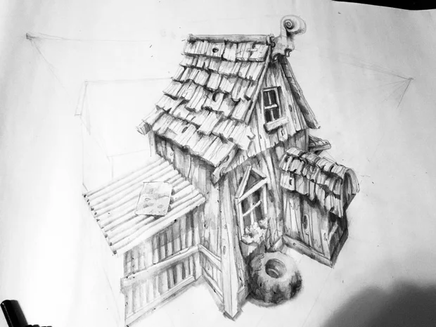
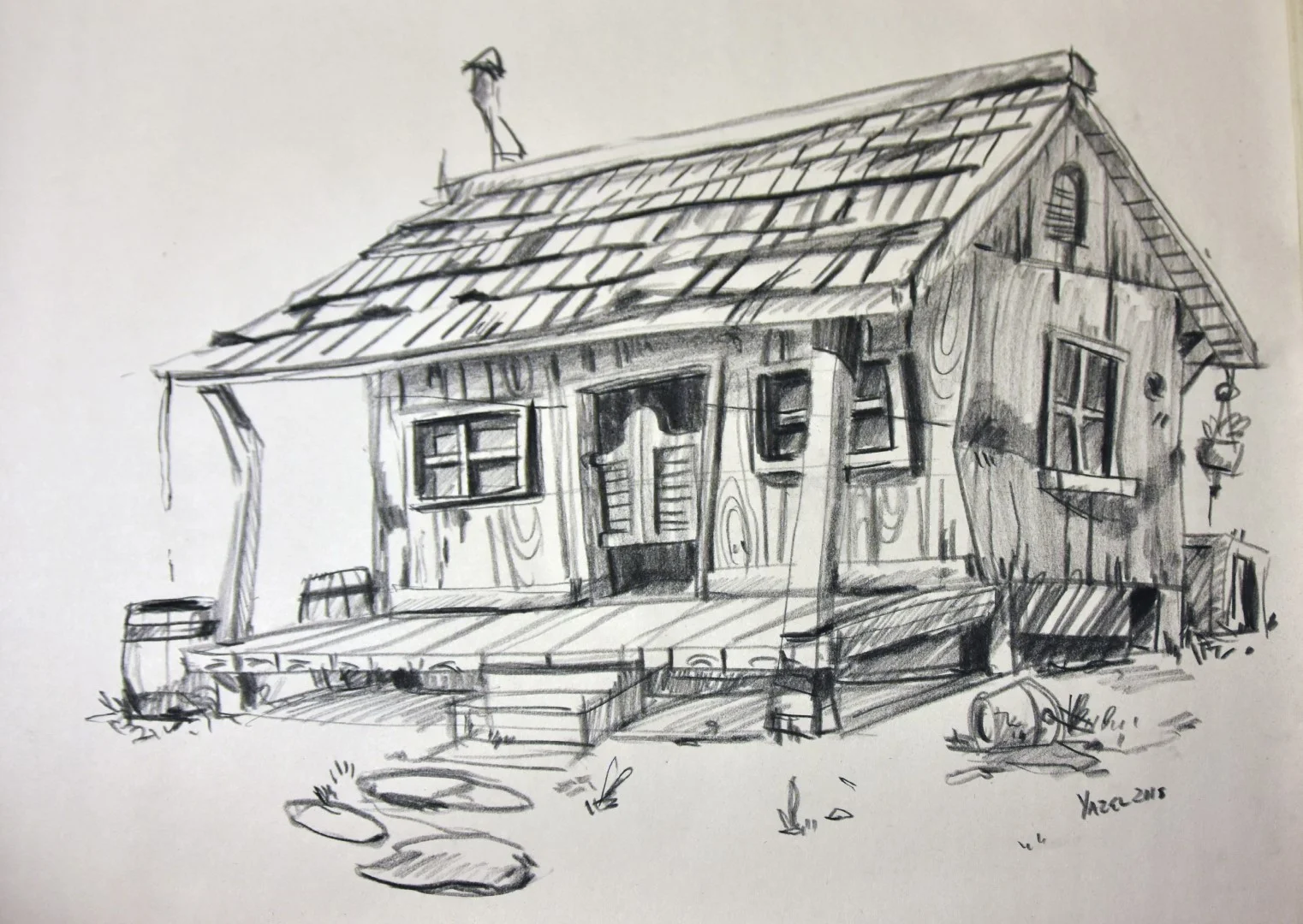
I've been wanting to draw more from reference this summer, so I've been taking my small camera with me when we leave the house to snap some pics on our travels. Because we're in the car most of the time, the pictures aren't great, but they are enough to get some reference out of. At the top of the post is a drawing totally from my head, I like it a lot but it's pretty unrealistic. Below you can see a drawing done from photo reference. While it's not perfect, it's a bit closer to the kind of drawings I'd like to keep working towards for my portfolio.
With these drawings I'm using an assortment of pencils, 2b, 4b, and some H. I'm not really picky, again I'm trying to make use of some materials I've had for far too long, haha.
This image here is what we'll be focusing on-
Starting as a shower thought, I scribbled this idea down quickly in my robe so I didn't lose it. This is again on newsprint with graphite. Something about it worked for me and I couldn't shake it, I really liked the pencil drawing, but I wanted to see if I could take it through the paces of production and retain the energy in the linework (something I often lose).
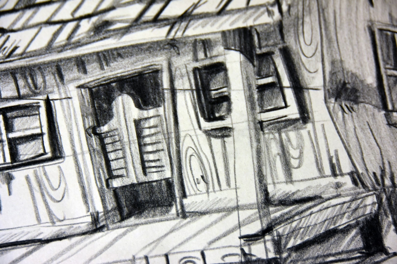
I'd swap this door for a better one later, but it looked nice on paper.
I took an image of the drawing with my phone and transferred it into photoshop where I made some adjustments to the contrast and set up my default "Digital light table", allowing me to see the original drawing, but work on top of it for a clean production drawing.
With the linework of the building completed as much as the original drawing was, I had to make the environment up a bit digitally where I had slacked traditionally. For me, being able to edit and adjust compositions like this is the biggest advantage of working digitally. I originally thought I would make this on a street in a forgotten old west town, but went for more of a "down on their luck" homestead. Adding a wilting garden and some hills in the background, I wanted the space to feel real, but still empty and lonesome as one might be out in the old west.
Here's the final layout image. I've decided to stop here as I've got some other work that needs to get done. Focusing on values was a great exercise for me. Let me know what you think down below! Maybe give some traditional sketches a try and see how it changes your digital work?
Best wishes,
Ethan


